Brass / Clay Golem
The desktop client for the Golem network, built for macOS, Windows and Ubuntu. It was the only part of a peer-to-peer market for computing power that an ordinary user ever saw.
Client
Golem Factory
Role
Sole designer at first, then design lead. Research, user interviews, testing and reporting to the board
Design team
A UX/UI designer, later a researcher. Two designers finished it
Type
Product design
Year
2018
Who it was for
Requestors, which here meant Blender artists who wanted a render to finish faster, and providers willing to rent out machines they were not using.
What I walked into
An application already late in development and a release date three months away, with me as the only designer on it.
A marketplace for other people’s computers
Golem is an open-source, decentralised marketplace for computing power. It enables CPUs and GPUs to connect in a peer-to-peer network, enabling users to rent resources from other users' machines. As a UX/UI specialist, I was tasked to work on the user interface client that was meant to connect the requestors (Blender artists) with providers (all the users willing to share their computing power).
Three months on my own sounds impossible and mostly was, but in that time the most important changes got proposed and built, and they came from three places: a heuristic evaluation of what already existed, interviews with the stakeholders, and corridor tests run next to the development team.
After this intense beginning, I could start the proper product design process. I've started by IDI with defined requestors' target groups. And with a live product already online with a user base growing daily, I could gather constant feedback via the company's dedicated chat and close cooperation with the QA team.
What worked
Making the main navigation consistent across every screen paid off fastest, because until then people were relearning where they stood on each tab. The wallet was rebuilt from scratch off user stories and detailed flows, which is how the team ended up with something both safer and easier to use. Defining personas and keeping a feedback loop running meant improvements went into every release instead of waiting for a redesign.
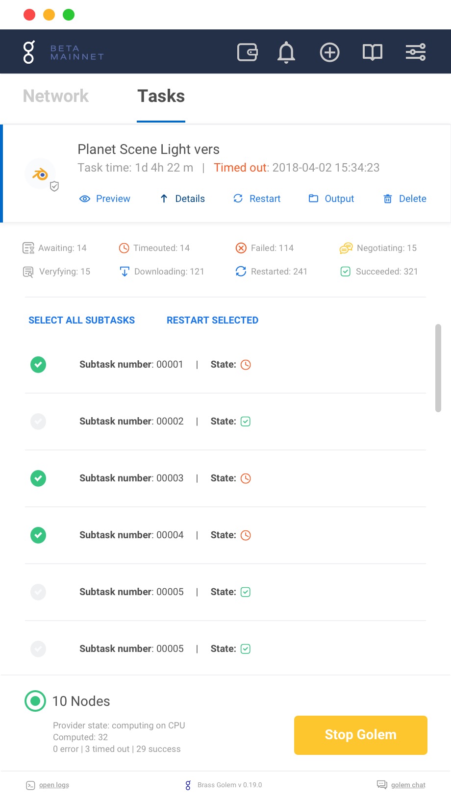
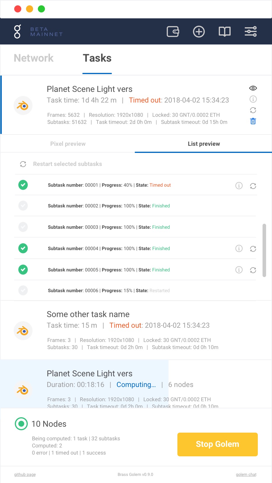
The rest was about making a complicated thing legible. Detailed task and subtask lists told people what the backend was actually doing rather than leaving them to guess. Every error that could not be solved on the backend was catalogued, and each one got a helper guide instead of a dead end. Underneath all of it the aim was transparency, because a product this novel only works if people can see what it is doing with their machine and their money.
UX tools used
Design tools used
Where it started
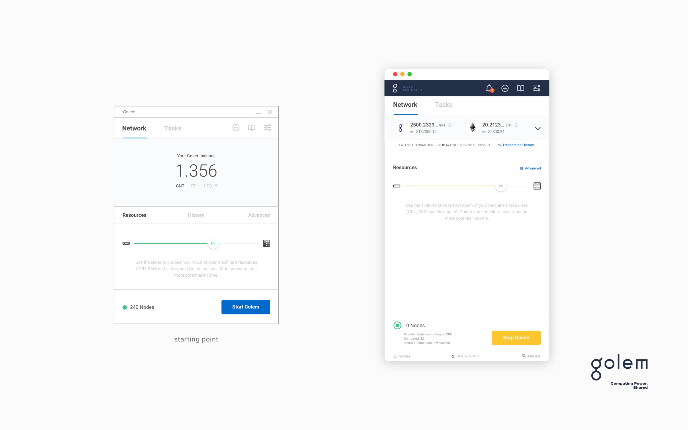
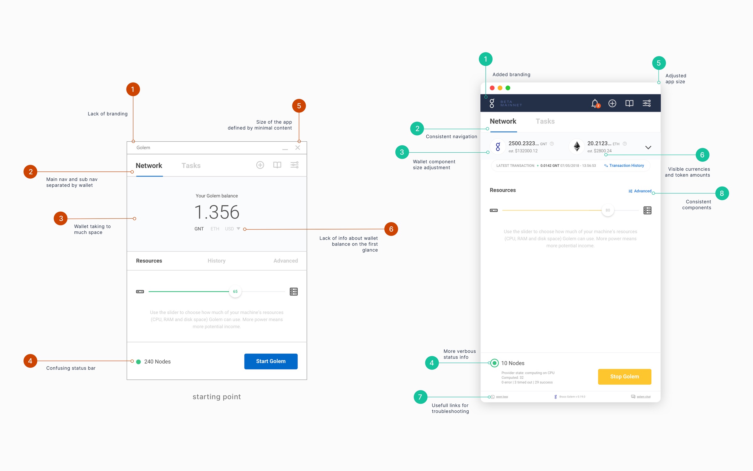
The first job was to put the existing interface in front of people and write down everything that went wrong with it. Six problems came back often enough to be structural. Nothing carried any branding, so the window could have belonged to any piece of software. The main navigation and the sub navigation were separated by the wallet, which left the wallet permanently in the way while still being too small to use. The status bar reported things nobody could act on. And the window was sized by its emptiest screen, so the app felt cramped the moment anything actually happened inside it.
Eight changes answered them. Branding went in, the navigation became one consistent thing, the wallet was resized and then rebuilt, currencies and token amounts became visible without opening anything, the status text started saying what was happening, links to troubleshooting appeared where people got stuck, the components stopped disagreeing with each other, and the whole window grew to a size that fits the busiest screen rather than the quietest.
How the changes got chosen
The first round of evaluations was run with Blender artists, before Golem went to mainnet. They were who the product was for, and the only people whose actual work it could make faster, so their reading of the interface was the one worth having early. After launch the evidence changed shape. There was a public community chat and it never stopped, so rather than scheduling more sessions I started treating it as a continuous source and pulling out the complaints that kept coming back.
All of it went into one sheet. Every issue got a plain description, a priority from the user's point of view, a technical difficulty from one to five, a count of how many people had hit it, and a note on whether design, frontend or backend was needed to fix it. Then I went through it with the development team and we scored it together. That last part is the part that worked: a designer's priority list is a wish, while a list the engineers have already put effort numbers against is a plan. The sheet became the backlog, and every row carried a link to its issue on GitHub.
It settled arguments that would otherwise have been about taste. Confusion in the navigation was real but never stopped anyone finishing a job, so it went in as low priority and easy, and got fixed cheaply and early. Timeouts on tasks and subtasks, which people got wrong again and again, earned a proper redesign. The price screen turned out to be a wording problem more than a layout one, so evaluation and bid swapped places and a dollar figure went in next to the token amount. And on the network trust setting the answers came back fifty fifty, which was the useful result: it meant do not touch it yet, go and confirm.
Some things the matrix simply parked, and it was right to. Covering transaction fees in GNT so that nobody had to go and buy Ether before they could use the product at all was obviously good for users and expensive enough that it stayed a backlog item rather than a fix. Writing that down honestly, next to its cost, is more useful than pretending it was a quick win.
The first run
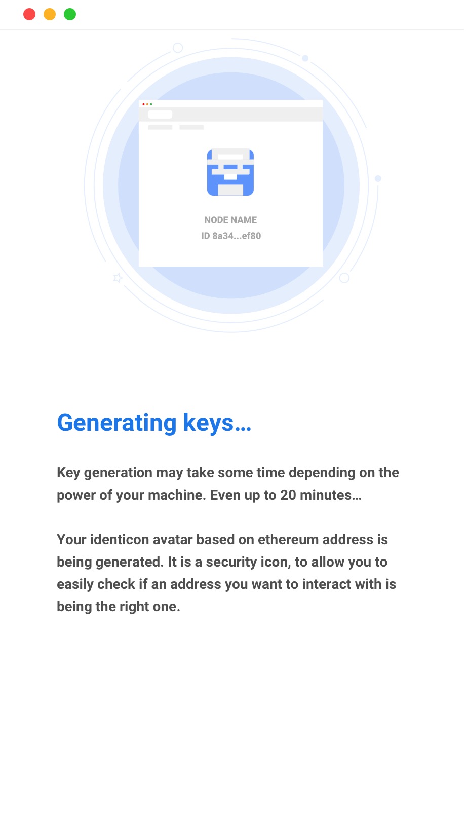
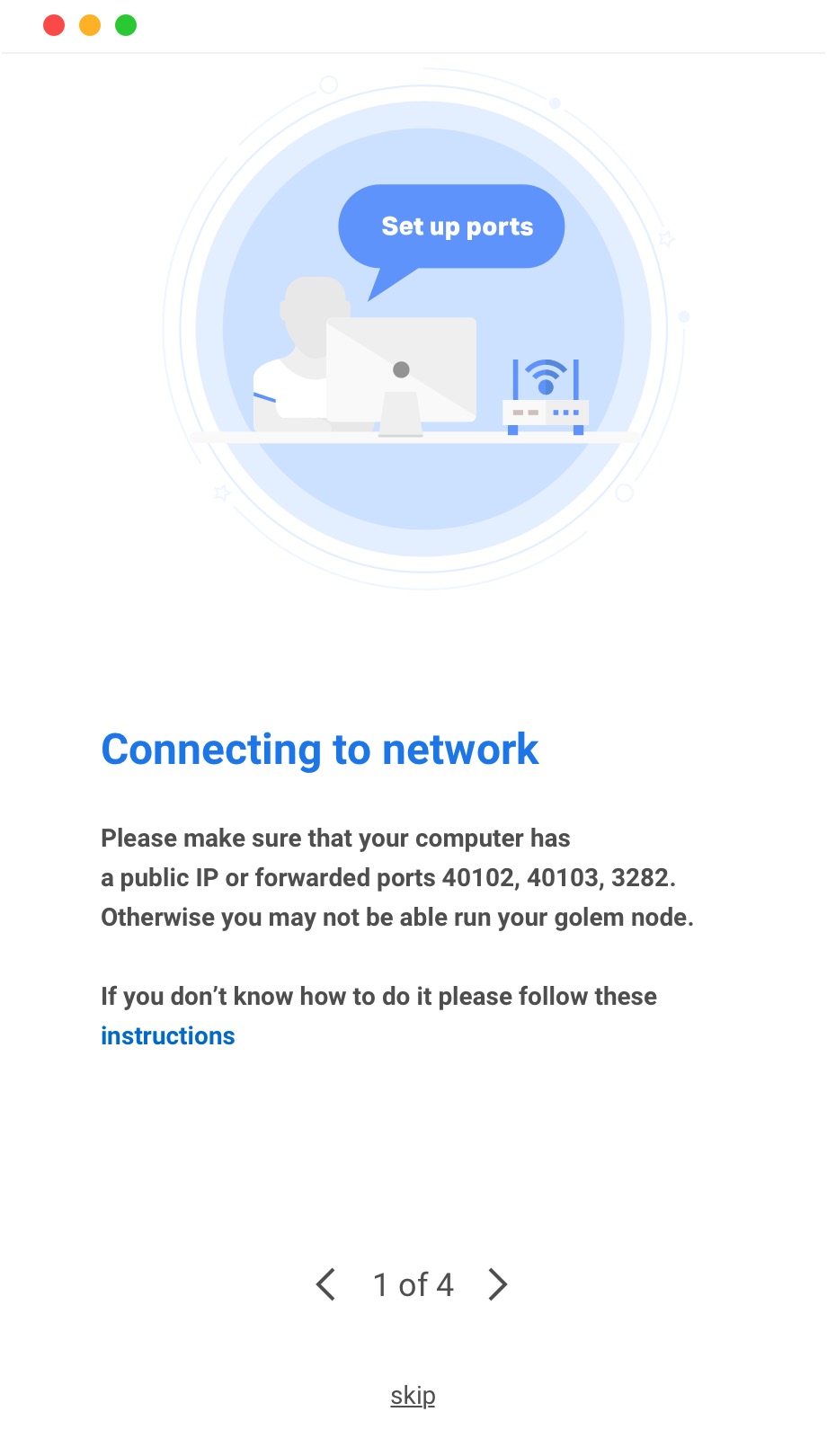
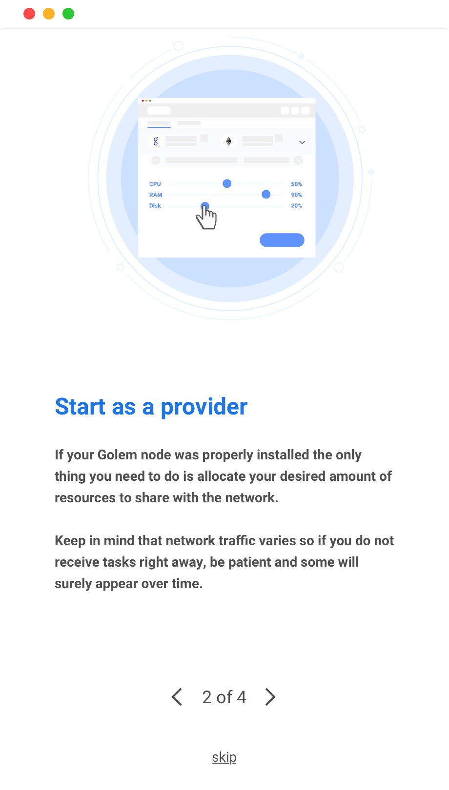
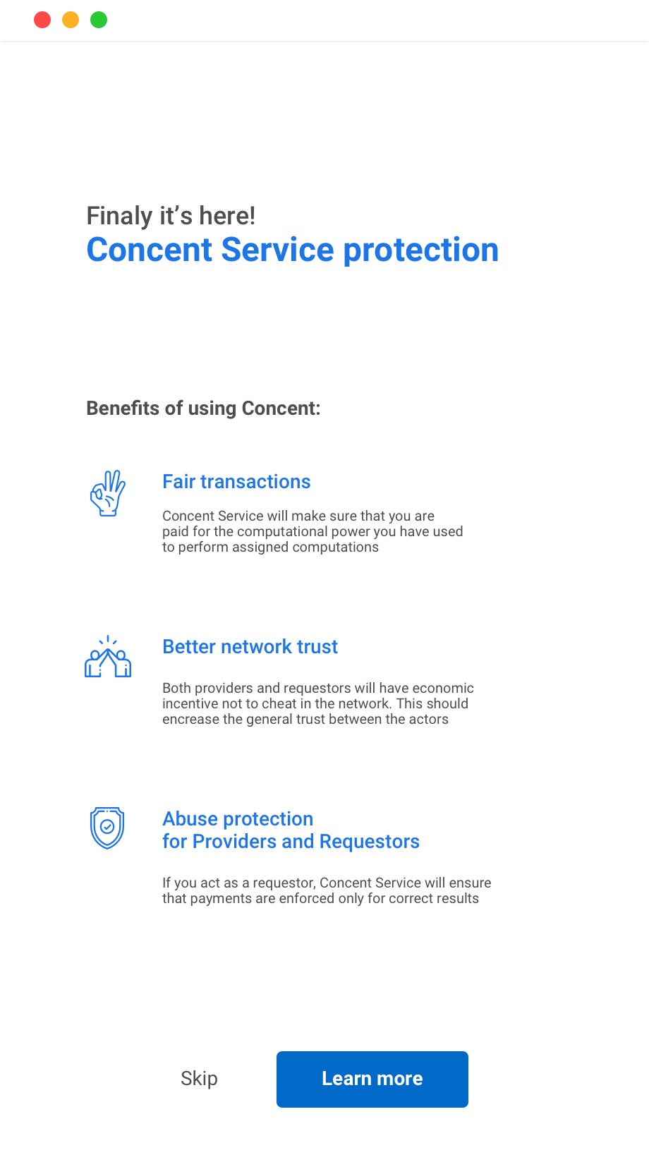
Nobody arrives at a decentralised compute marketplace knowing what to do with it. So the first run generates your keys and shows you the identicon that will stand for your address, tells you plainly whether your machine can be reached from outside and which three ports have to be open, says what being a provider actually commits your computer to, and introduces Concent, the deposit that covers both sides when a job goes wrong. Four steps, and every one of them can be skipped by somebody who already knows.
The application
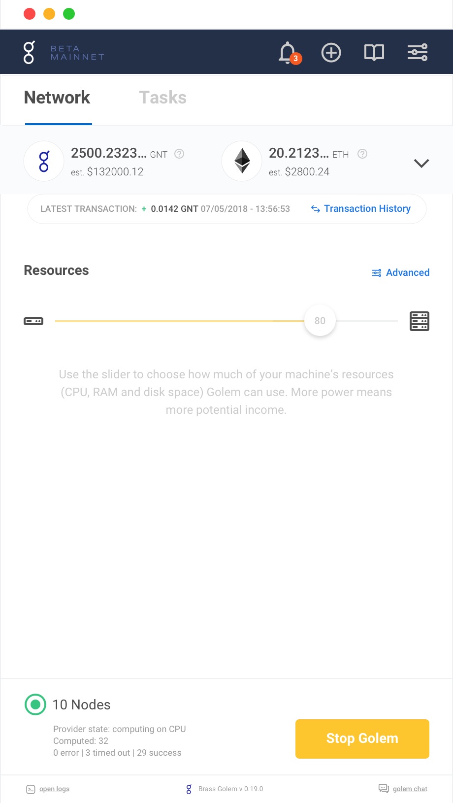
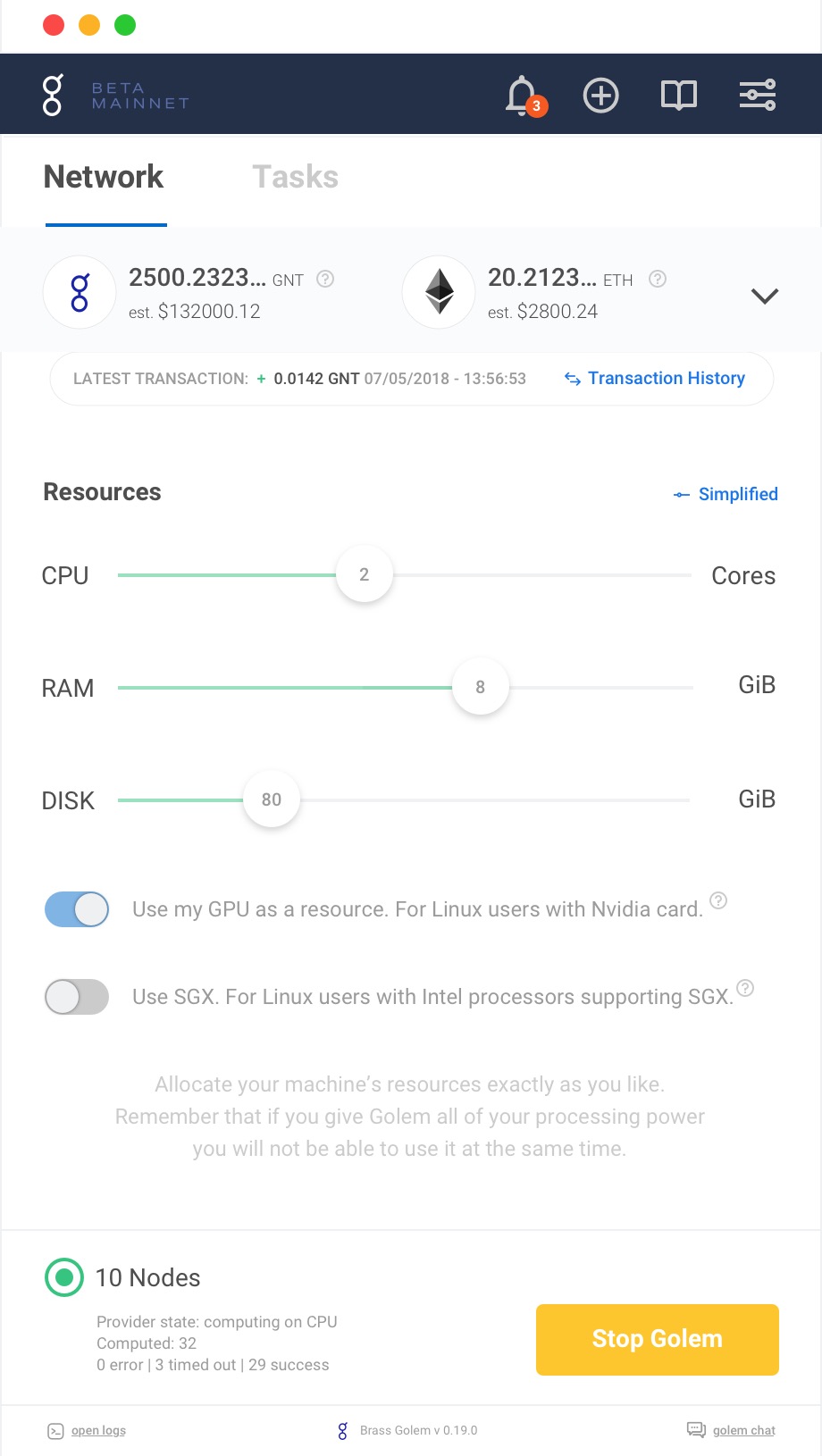
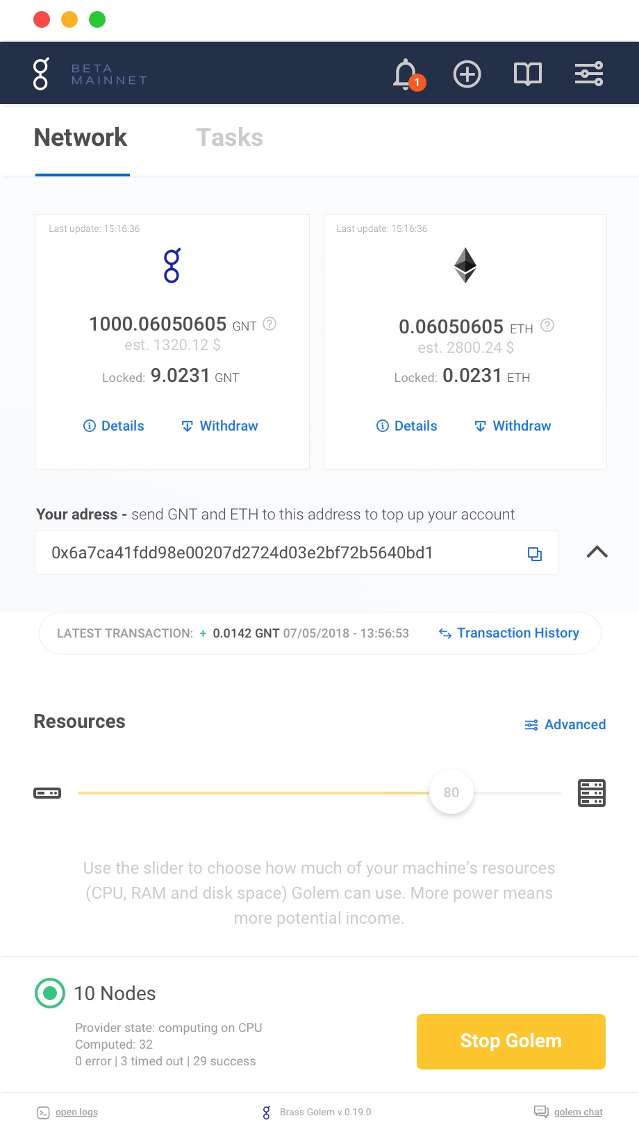
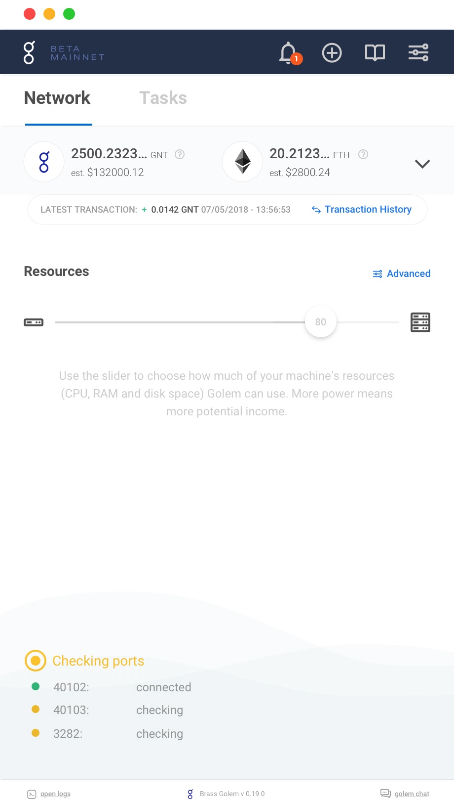
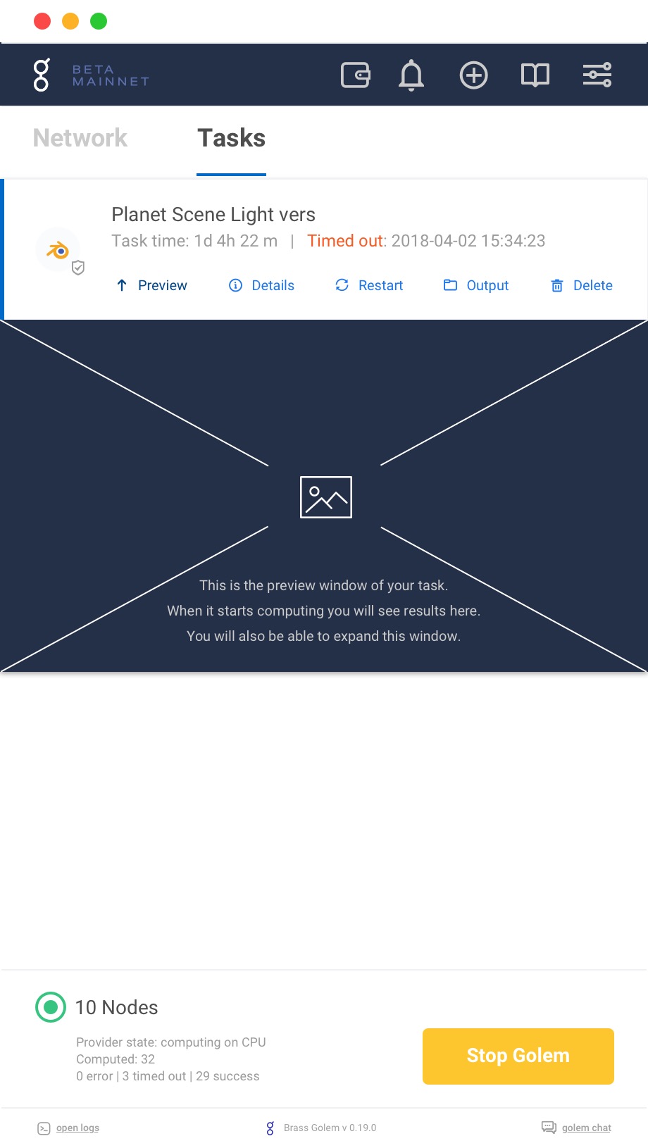
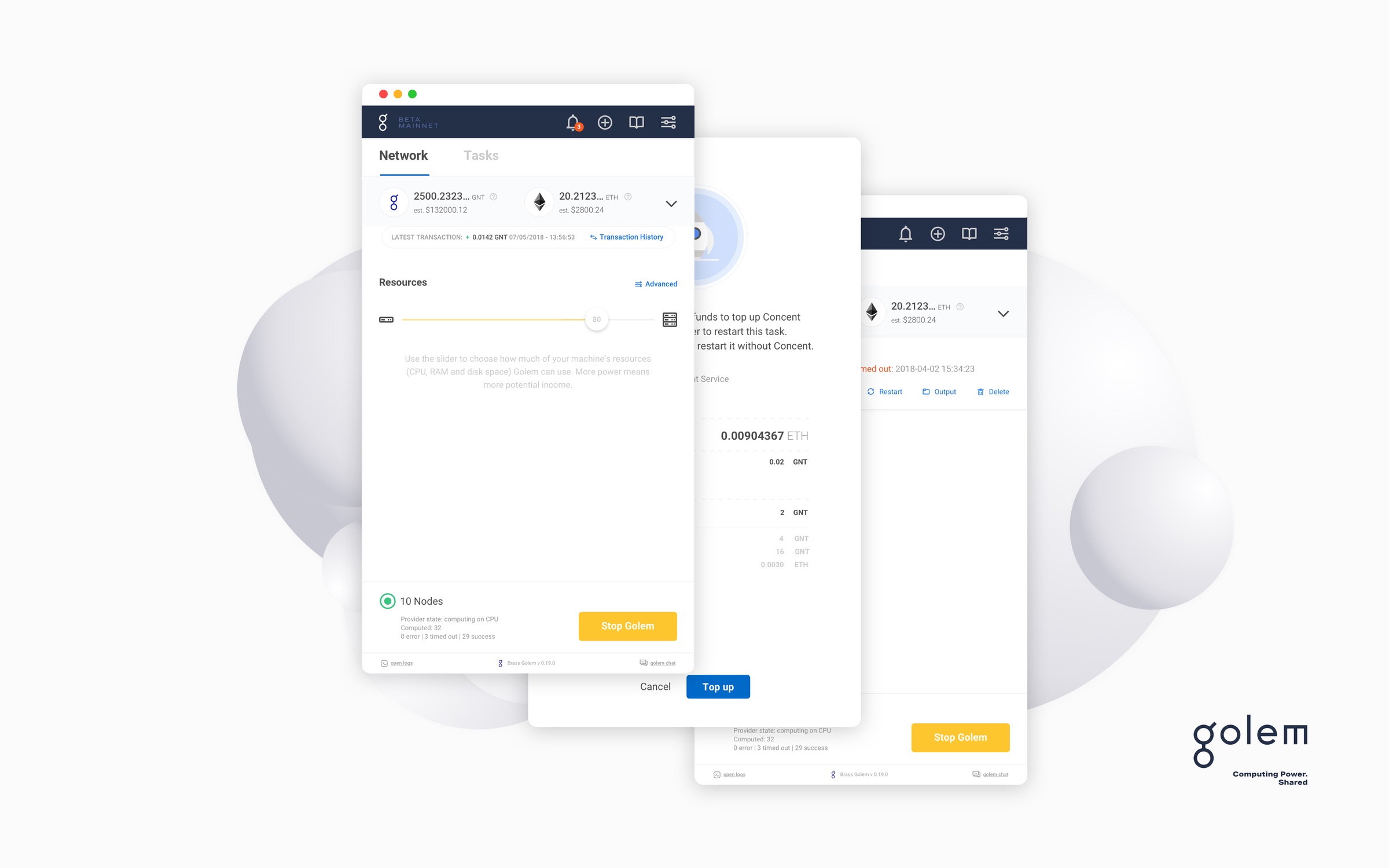
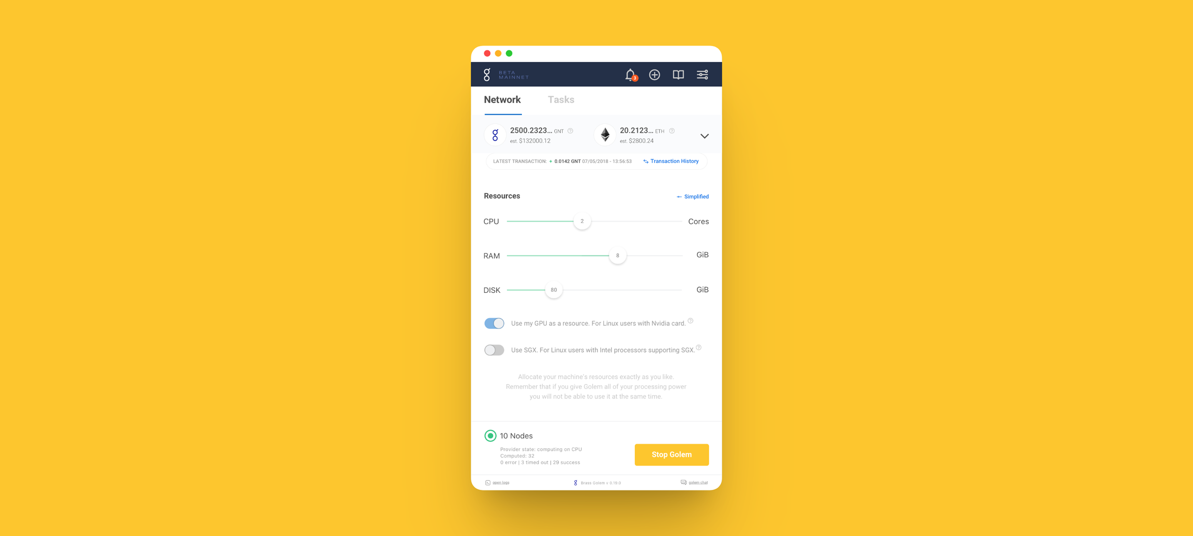
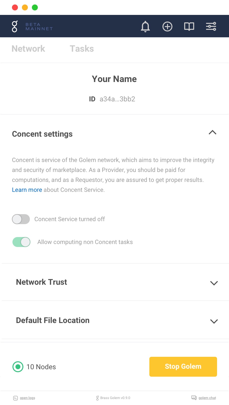
Two tabs carry the whole product. Network is your machine: what you are lending, how much of the processor, memory and disk, whether the graphics card counts, and what is sitting in the wallet. Tasks is the work: a job split into subtasks, each with its own state and timing, a preview of the frame being rendered, and the ability to pick out the subtasks that timed out and restart only those.
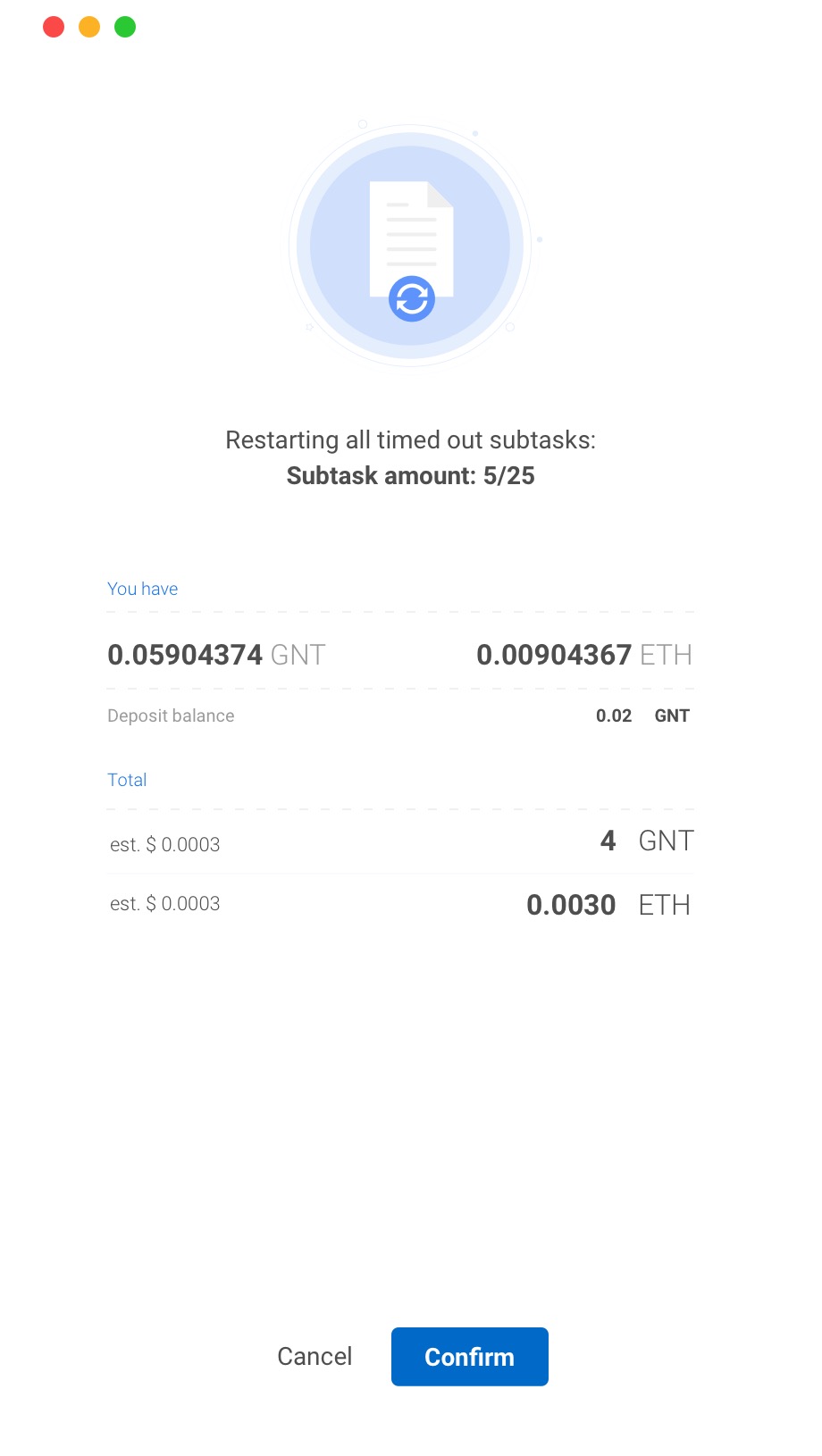
The sequence ends on a confirmation that states what restarting five of twenty five subtasks will cost, in both tokens, before you agree to it. In a product that spends your money while you are not looking, that screen is the whole argument.