iKantory
Product and brand design for iKantory platform, the comparison site connecting regular users with currency exchange service owners
Client
Sequence Software House
Role
Sole designer. Desk research through to final UI
Type
Product design
Year
2016
Two audiences who want opposite things
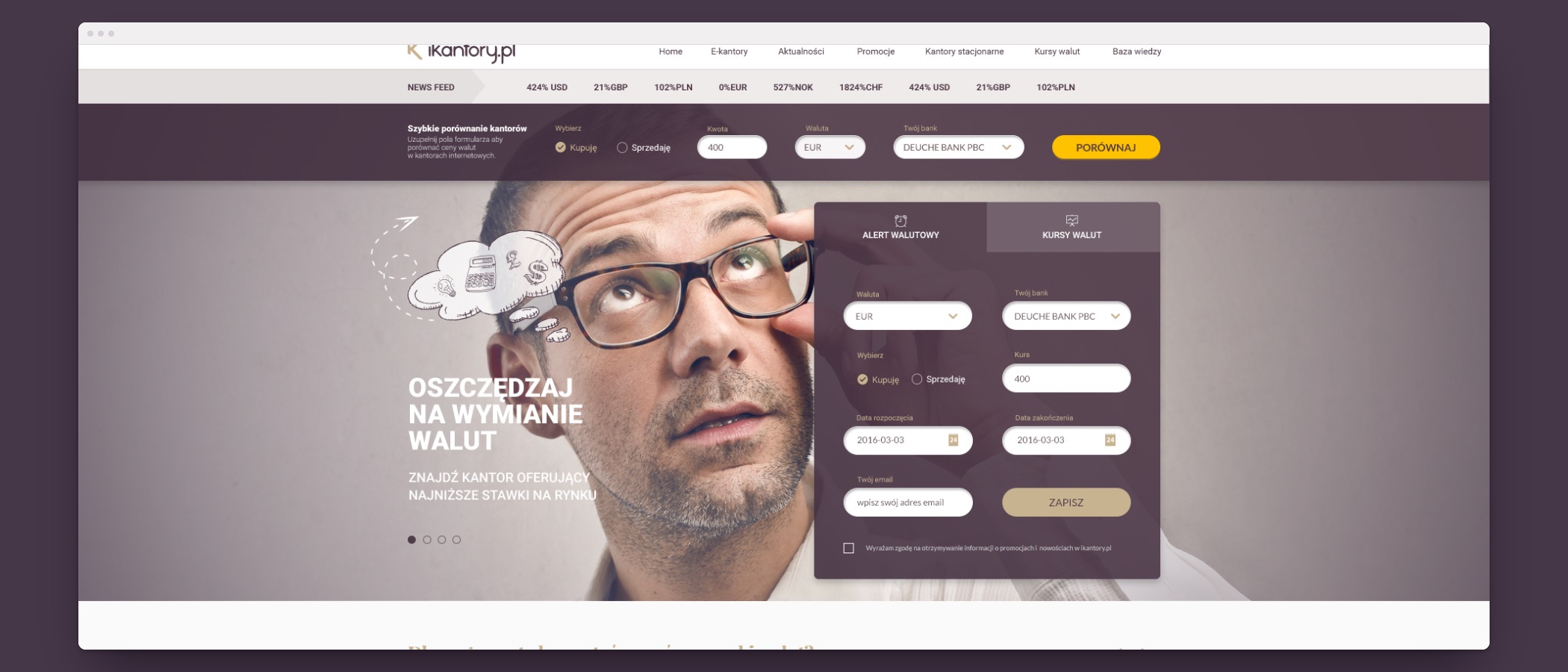
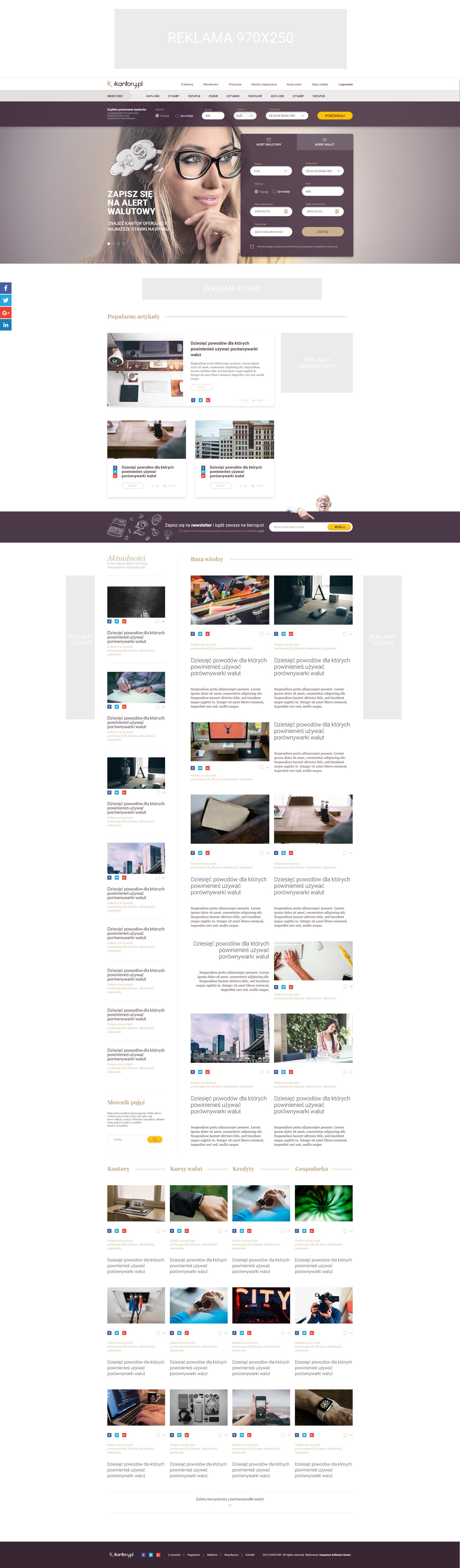
iKantory compared what Polish currency exchanges were paying for euros, dollars, pounds and francs, and put the best offer in front of anyone about to change money. The business wanted more than a rate table. It wanted to be the place people checked first about currency generally, so a knowledge base, news, categories, tags and articles were part of the product from the start rather than bolted on later.
Two audiences, and they want opposite things. Somebody changing two thousand zloty wants one number and a map pin. An exchange owner wants to be found, wants their rates to be current, and wants to charge for the listing. The site had to serve the first group in seconds and give the second group somewhere to work.
I ran the whole thing: desk and competitor research, wireframes, user flows, the brand, the high fidelity designs and the day to day with the backend and frontend developers. The design system was built with Atomic Design, which in 2016 was still a fairly new way to work, and it is what made the volume possible. Every screen was drawn three times, at 1920, at 640 and at 320.
It shipped as a beta, built to the brief and the guidelines it started from, and then it stopped. The angel investor backing it walked away and the company closed the product. The design was finished and the thing it was for was not there any more, which happens, and it is the reason there is nothing live to link to.
That last part is the part worth pausing on. Responsive was not a given then. A lot of Polish portals in 2016 shipped a desktop site and a separate stripped down mobile one, or nothing at all below a tablet. Here every page exists at all three widths as a drawn design, not as a guess left to the developers, including the pages nobody shows in a portfolio: the error states, the transactional email, and the whole back office an exchange owner logs into.
UX tools used
Design tools used

The table that had to stop being a table
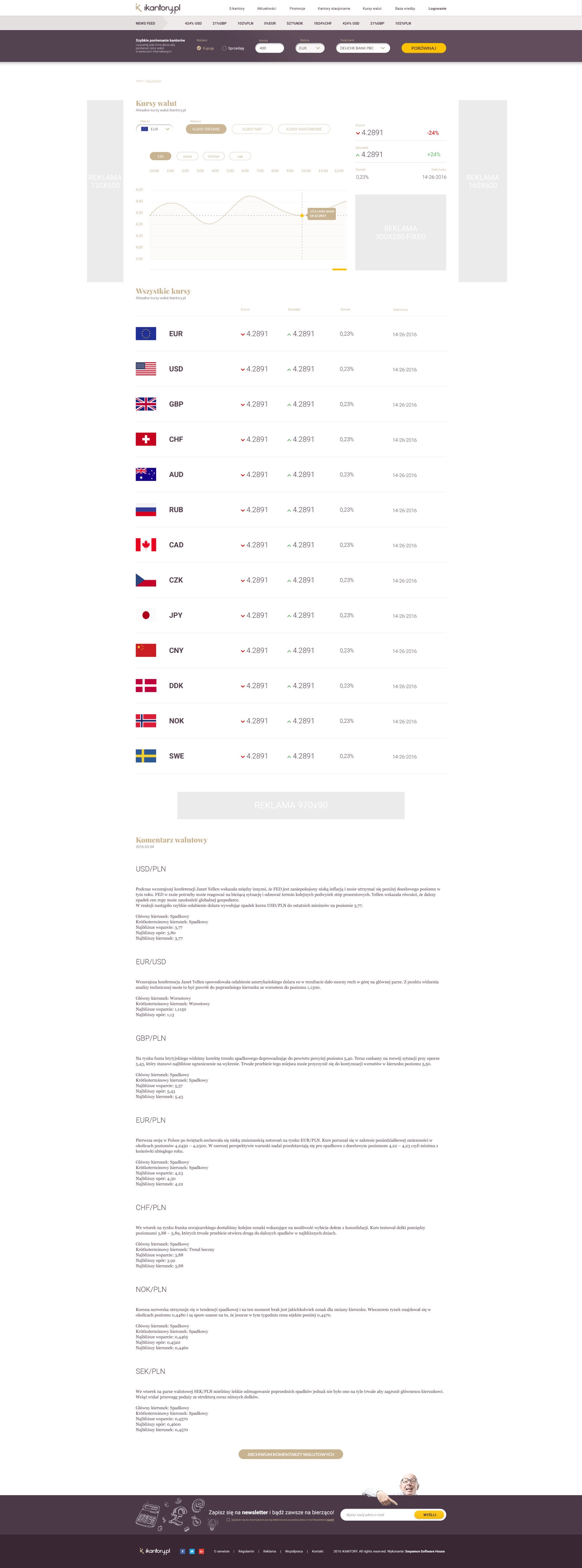
The rate list is the product, and it is the screen where 320 pixels actually hurt. On a desktop it is a wide table: currency, flag, buy, sell, spread, the exchange that is offering it, a button. None of that survives a phone column at a readable size.
So on a phone it stops being a table. Each currency becomes a card with the flag and the pair as the heading and the two numbers underneath at a size you can read while standing up, which is where somebody checks a rate. The information is the same and the shape is not, which is the difference between a responsive design and a shrunk one.

The half nobody sees
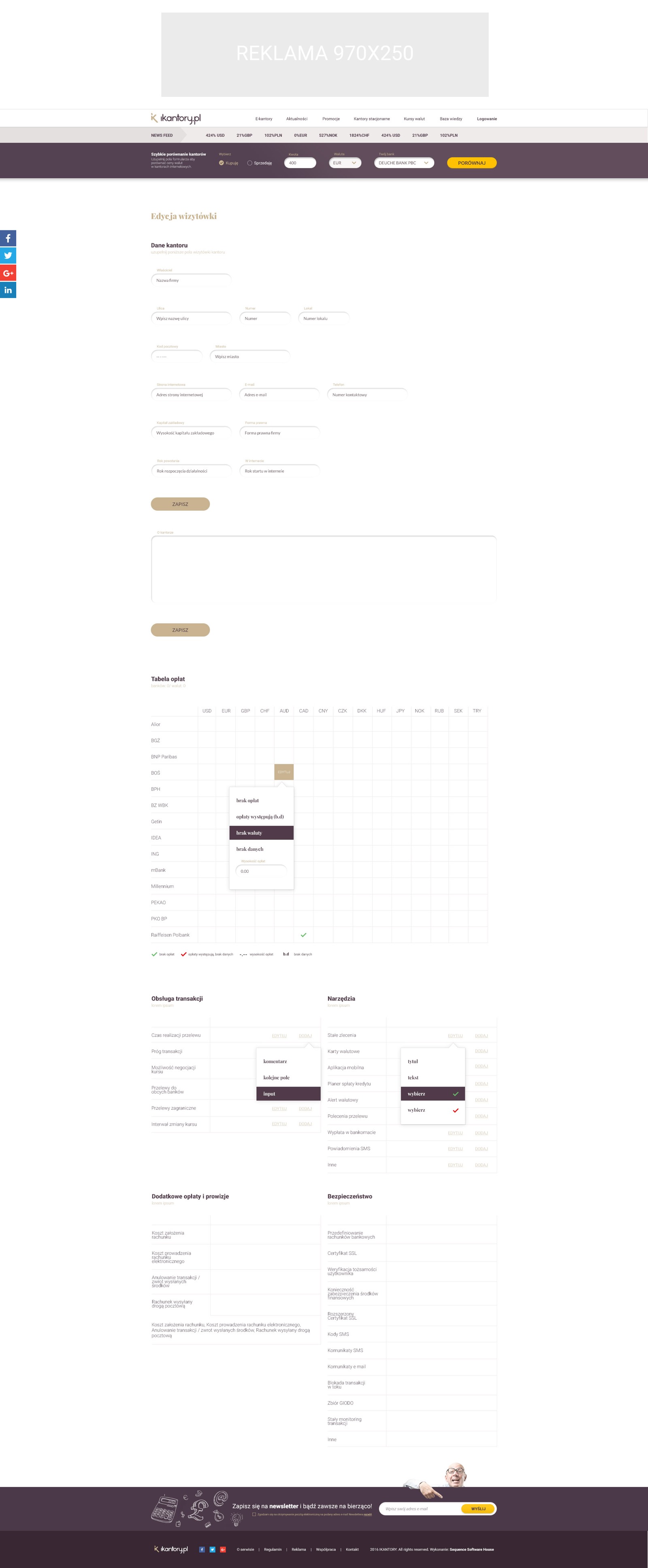
An exchange owner logs into the other side of the product and keeps their own listing alive: the profile a customer lands on, the branches, the opening hours, which banks they work with, the fee table, and which currencies they trade, with a form that grows when they trade more than the usual four.
This is unglamorous work and it decides whether a comparison site has anything to compare. If updating a rate is annoying, the rates go stale, and a stale rate on a comparison site is worse than no rate, because somebody drives across town for it. The back office got the same design system and the same three widths as the public pages.