Pana Jana
Craft beer brand design for a small homemade brewery
Client
Pan Jan
Role
Sole designer. Identity and labels
Type
Visual identity
Year
2017
A beer you cannot buy
The aim was to design an identity that would reflect the character of the product and, most importantly, its maker. In addition, the brand is not commercially distributed, so it was essential to give it the feel of exclusiveness and value from the lack of universal accessibility.
The keywords defined in the initial design stage were: tradition, craftsmanship, quality, and uniqueness.
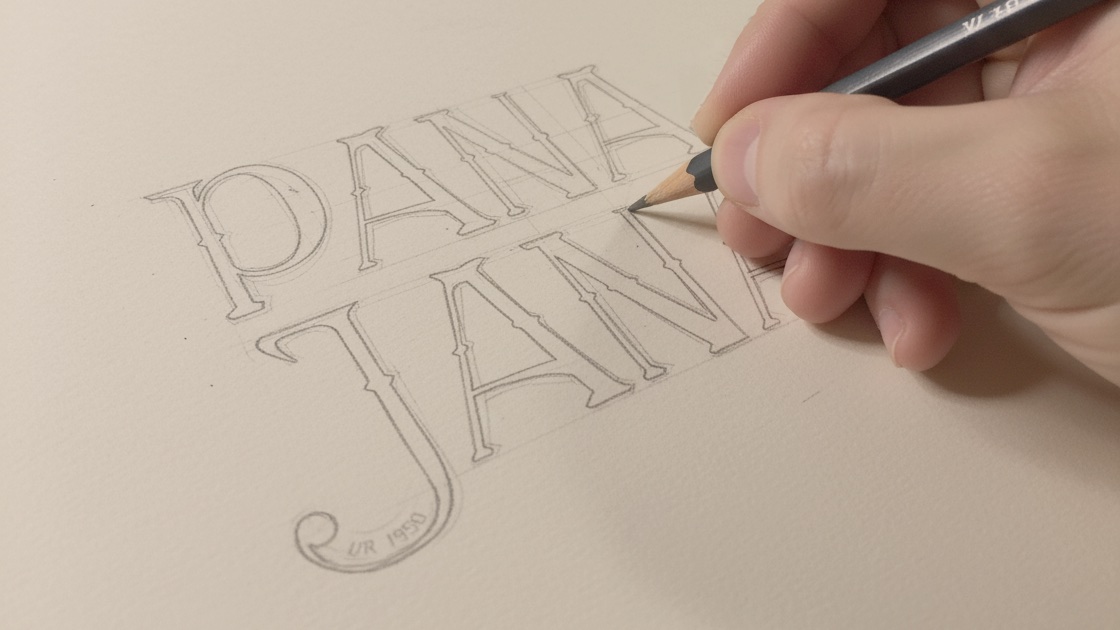
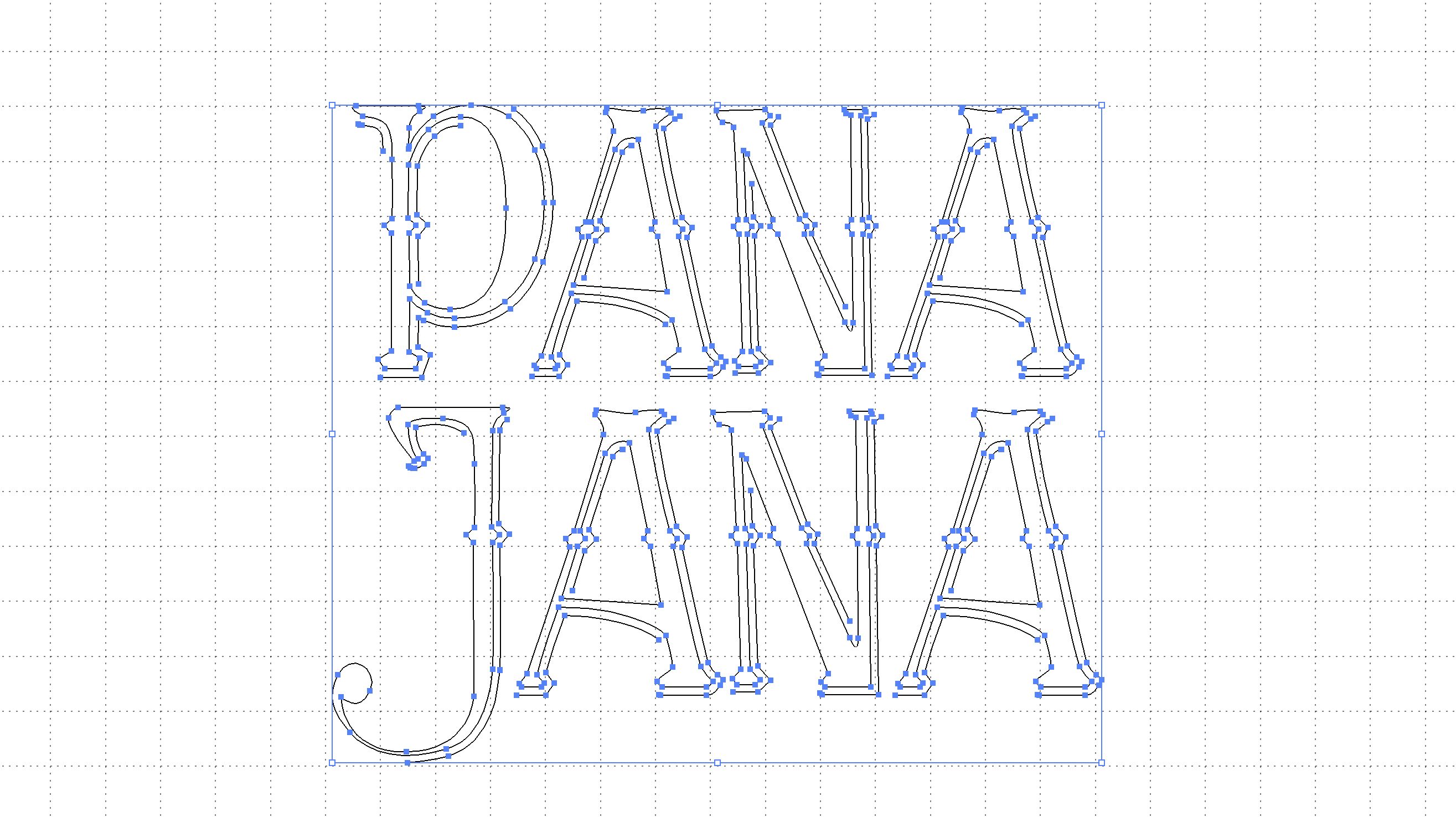
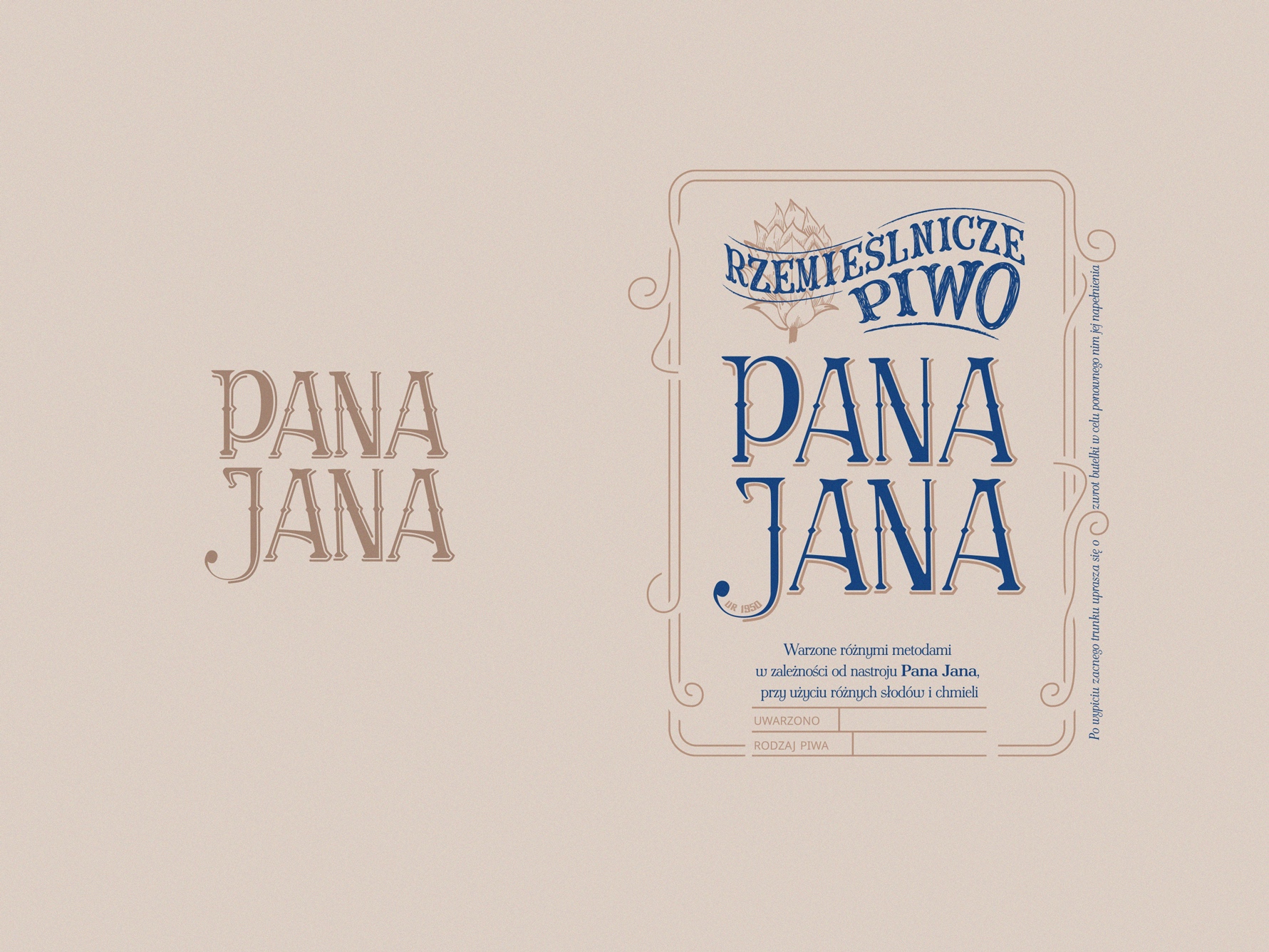
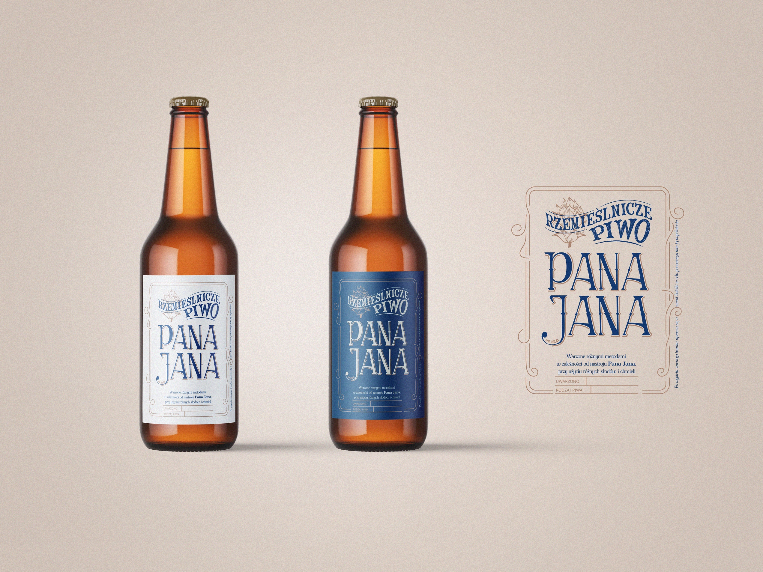
I've created hand-written typography for that brand combined with "Antykwa Półtawskiego" font. The original font was designed in the twenties of the XX century by the Polish typographer Adam Półtawski (born 15 May 1881 in Warsaw, died 19 September 1952 in Cracow), hence the name. Although the author himself named it _antykwa polska_. By this design, I've tried to capture the specific features of the Polish written language and give the feeling of a product well settled in tradition. It also brings to mind a bygone era and true craftsmen who were undenied experts in their work. Thus, it delivers the feeling of mysticism and high quiality achieved by an individual master.
A space to write the bottle number by hand
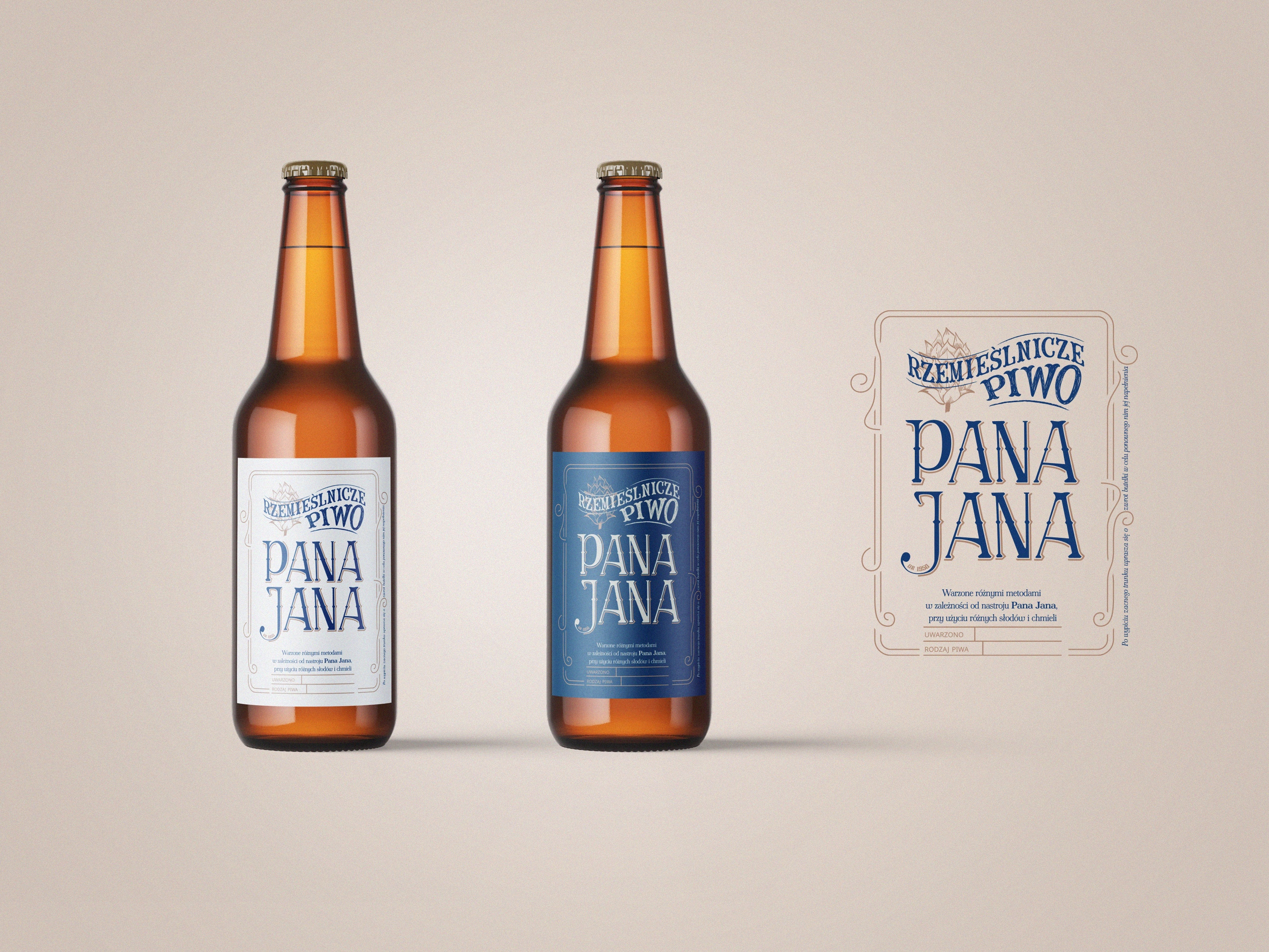
The label comes in a light and a dark variant, which is what lets one design carry the different beers that get made in small batches. The shapes of the letters set it apart from the other modern brewery brands. Each bottle has a space where its serial number is written in by hand, and that is the part people pick up on.
It met the brief and it is still in use.
Design tools used