iMapp
Website for a blockchain software house
Imapp has been writing blockchain software in Warsaw since 2013, for the Ethereum Foundation, Golem, OmiseGO and Erigon among others. That is an unusually strong record in a field full of people who arrived last year. The problem was that their website did not say so. I designed imapp.pl to sound like the engineers who work there rather than like an agency selling to them.
The problem
Blockchain agency websites all look the same: a gradient, a floating 3D cube, a wall of buzzwords, and no way to tell a team of ten years from a team of ten months. Imapp had the track record to be picky about clients and a site that made them look like everyone else.
Voice before layout
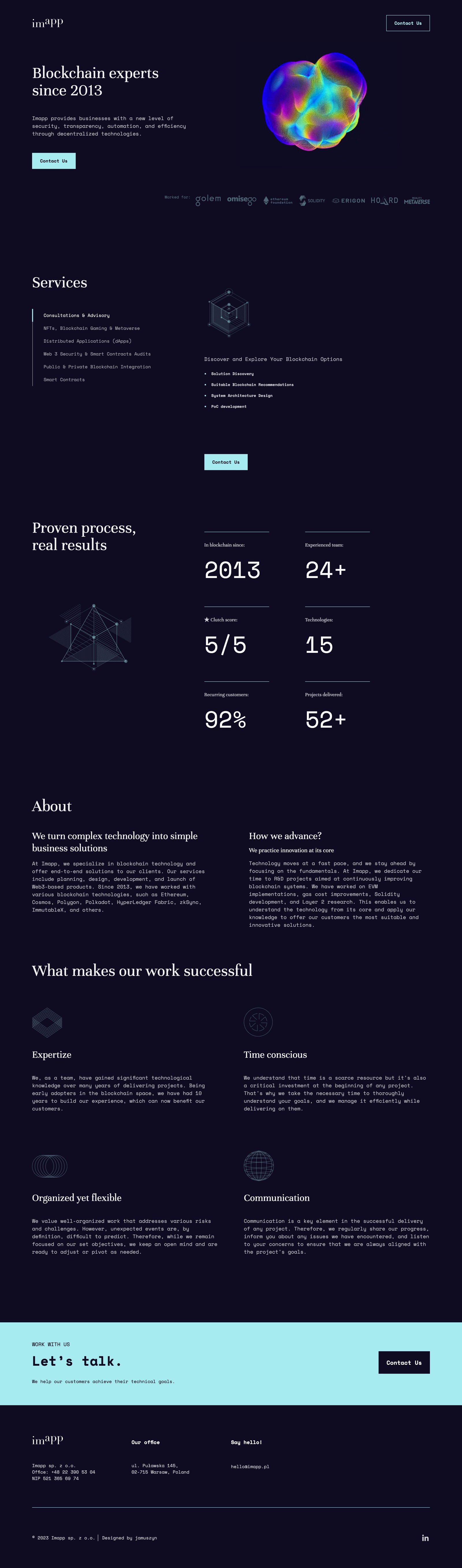
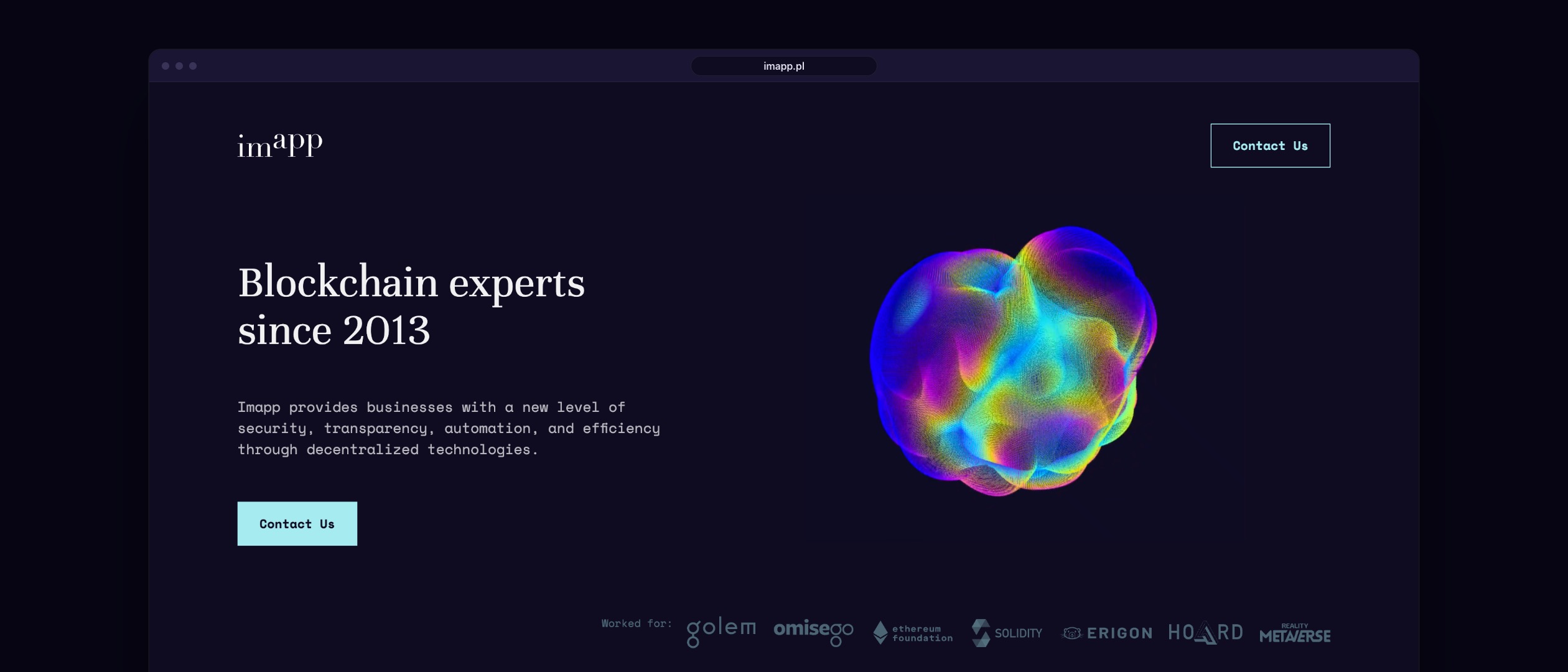
The identity is carried by two typefaces doing opposite jobs. Headlines are set in a serif, which in this category reads as institutional and old, in the good sense. Body copy is monospaced, which reads as people who spend their day in a terminal. Neither is decorative. Put together they say “engineers who have been here a while” before anyone reads a word of the actual copy.
Proof instead of adjectives
The strongest thing Imapp owns is its client list, so it sits directly under the first headline: Ethereum Foundation, Golem, OmiseGO, Solidity, Erigon. Below that the page answers the question a technical buyer actually asks, with numbers rather than promises:
Then the numbers: in blockchain since 2013, which predates most of the industry, more than 24 engineers, a Clutch score of 5 out of 5 and 92% recurring customers. The services under them are set as a plain list rather than as cards with icons.
Restraint on a dark canvas
Near black navy throughout, one mint accent, and the accent is reserved for things you can click. Illustrations are thin isometric line drawings rather than stock renders, so they cost nothing in load time and cannot date the way a 3D trend does. The single piece of spectacle is the generative form in the hero, and it earns its place by being the only one.
What it had to survive
A site like this is maintained by developers, not by a marketing team. So the layout is built from a small number of repeatable blocks, the type scale is short, and nothing depends on a hero image being recropped by hand. Two years on it is still running with the original design intact, which is the only durability test that counts.
Design